

See the designer
The integration catalog stays on the left, the borrower preview is in the center, and Appearance is on the right. On smaller screens, switch between the Integrations, Preview and Appearance tabs.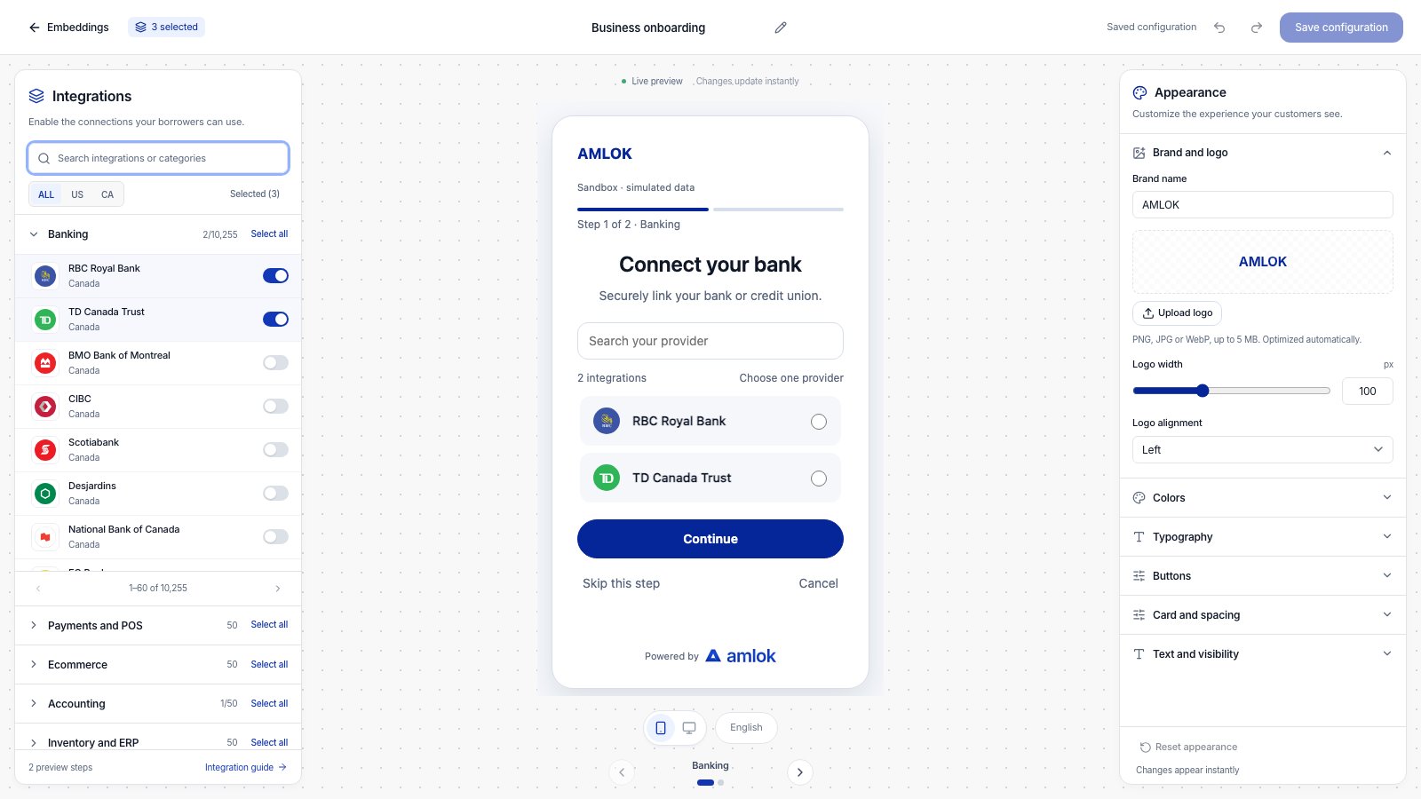
Change the controls in Appearance and inspect the result in the borrower preview before saving.
Watch a short walkthrough
This 48-second walkthrough uses example data and on-screen instructions, with no audio. Use full screen to read individual controls. The written steps below cover the same workflow. Download the video · Download captions (WebVTT)Design your borrower experience
1
Start with your brand
Expand Brand and logo. Set Brand name, then optionally select Upload logo. Choose a PNG, JPG or WebP image up to 5 MB; transparent backgrounds are supported. The builder optimizes the image automatically.Adjust Logo width and Logo alignment. Use Replace logo for another image or Remove logo to show the brand name again. This logo belongs to the embedding and does not change the organization’s profile logo. Wait for Preparing… to finish before saving.
2
Set colors and typography
Expand Colors. Use the color picker or enter a six-digit hex value, such as the default Amlok accent
#052698. Check the Readability guidance after changing text or backgrounds.In Typography, choose a built-in font and adjust body size, heading size, heading weight and alignment. Review long headings and provider names in the preview as you change these settings.3
Shape the buttons and layout
In Buttons, choose Solid or Outline, then set height, corner radius and shadow. Solid button text in Colors applies to solid buttons. Outline buttons use the brand accent for their text and border.Use Card and spacing to adjust the card and integration corners, border, shadow, inner padding and spacing between integrations. Keep enough room for a borrower to read and select each provider comfortably.
4
Write the category instructions
Expand Text and visibility and choose a Category. Edit its Step heading and Step description. Use Reset category text to restore that category’s default wording.You can also change the Continue, Connect and Back labels and the provider-search placeholder. Use the switches to show or hide Step progress and Amlok attribution.Only categories with enabled integrations appear in the preview. Editing a category’s text does not enable its integrations.
5
Check each step and save
Switch between Mobile preview and Desktop preview, then use the arrows or category dots to inspect each step. The borrower selects one provider at a time per category. Selecting another provider replaces the previous choice in that category; other categories keep their selections.Select Save configuration. Wait until the toolbar shows Saved configuration before leaving. The name, integrations and appearance are saved together.
What each section controls
New embeddings start with Amlok colors. With Amlok attribution enabled, the footer shows Powered by followed by the full Amlok symbol and wordmark. Uploading your own header logo does not replace this footer branding. Existing custom colors are preserved when you reopen a saved embedding.
Undo or restore the defaults
Use the toolbar’s Undo change and Redo change buttons to move through edits made in the current editing session. Reset appearance restores the default logo, colors, typography, layout and text after you confirm. It keeps the embedding name and enabled integrations. You can undo a reset before leaving the editor. Resetting also remains unsaved until you select Save configuration. Leaving with unsaved changes prompts you to keep editing or discard them. Previewing a design does not connect a real provider account or update an existing borrower session.Use the saved design
Saving an edited configuration creates a new version. Open its record drawer to find the configuration version identifier. Your developer uses that version when creating new embedding sessions through the Integrations Hub API workflow. Existing sessions keep the design, text and integrations of their original version. To use the updated design, create new sessions with the new version identifier. There is no separate publish action in the style designer.Check before sharing
- Review all enabled category steps on both device previews, including long provider names and custom instructions.
- Use the Readability guidance in Colors. Aim for at least 4.5:1 for normal button, body and supporting text against their backgrounds.
- Keep required names and button labels filled in. Invalid colors or sizes leave the preview at the last valid value; correct the input before moving away from it.
- If a logo upload fails, try a supported image within the size limit. An upload error keeps your previous logo.
- If another editor has changed the record, reopen its current version before saving conflicting changes.